Beyond the favicon: colours, manifests and real app polish
The favicon is half the job. Theme colours tint the browser around your site, and a manifest is what home screens read. Here is what each file buys you, and which ones to skip.
The tiny icon is only half the story
A favicon gets your site recognised in a tab bar. Everything around it - the colour of the browser chrome on a phone, the icon someone gets when they add your site to a home screen, the splash screen while it loads - comes from two other things: a meta tag and a small JSON file.
Most guides hand you the full set and tell you to ship all of it. This one does the opposite. Each piece below comes with what it actually buys you, and an honest note on when it buys you nothing, so you can decide rather than cargo-cult. (If you're still choosing the mark itself, favicon design best practices is the place to start - nothing below rescues a logo that turns to mush at 16px.)
Theme colour: one line, phone-sized payoff
The theme colour is a single meta tag in your head:
<meta name="theme-color" content="#2e5c85">On Android Chrome it tints the browser UI around your page. On iOS and macOS Safari it can tint the tab bar area. On a desktop browser with your site open in a normal tab, it mostly does nothing until someone installs your site as an app - this tag earns its keep on phones.
Two refinements worth making:
Give dark mode its own colour. The tag accepts a media attribute, so you can serve a different tint to each mode:
<meta name="theme-color" content="#2e5c85" media="(prefers-color-scheme: light)">
<meta name="theme-color" content="#16324a" media="(prefers-color-scheme: dark)">
If your brand colour is perfect on white and muddy on charcoal, this is the fix: keep the hue, drop the lightness for the dark variant.
Check the contrast before you commit. The browser draws its own icons and text over your colour. A mid-grey or a pale pastel can leave the back button barely visible, and Safari will quietly adjust or ignore a colour it decides is unreadable. Test on an actual phone rather than trusting the hex code.
The honest limit: not every browser uses it, and the ones that do apply it differently. Treat it as polish that most of your mobile visitors will see, not as a guarantee.
The web app manifest, and what it actually buys
The manifest is a JSON file that describes your site as an installable app. A complete, realistic one looks like this:
{
  "name": "Copper Kettle Store",
  "short_name": "Copper Kettle",
  "start_url": "/",
  "display": "standalone",
  "background_color": "#ffffff",
  "theme_color": "#2e5c85",
  "icons": [
    { "src": "/android-chrome-192x192.png", "sizes": "192x192", "type": "image/png" },
    { "src": "/android-chrome-512x512.png", "sizes": "512x512", "type": "image/png" },
    { "src": "/maskable-icon-512x512.png", "sizes": "512x512", "type": "image/png", "purpose": "maskable" }
  ]
}
Link it from your head with <link rel="manifest" href="/manifest.webmanifest">, and here is what each field is doing:
- name and short_name. The full name appears on splash screens and install prompts. The short name is what sits under the home screen icon, so keep it to a word or two - Android truncates long ones without mercy.
- display: standalone is the line that makes an installed site open without browser chrome, like an app.
minimal-uikeeps a sliver of browser. For a normal website, either is fine. - background_color paints the splash screen while your page loads. Match it to your page background so launch doesn't flash white-then-brand.
- icons. The 192 and 512 PNGs cover home screens and splash screens. The third entry is the interesting one.
The maskable icon is the one people skip and shouldn't. Android doesn't show your icon as you drew it - it masks it into whatever shape the launcher uses, circles and squircles mostly. A normal icon with the mark near the edges gets its corners eaten. A maskable icon has a solid background and keeps the mark inside the central 80% or so, so any mask crop still shows the whole logo. If you ship a manifest at all, ship one of these; a cropped logo on someone's home screen looks worse than no install prompt ever would.
Do you actually need a manifest?
Here's the counterpoint most favicon guides won't give you: for a marketing site or a store nobody will install, probably not.
What a manifest buys you is an install prompt, a home screen identity and a splash screen. If nobody is going to add your site to their phone, those features never fire, and the favicon set plus a theme-colour tag covers every surface a visitor will actually see. Some platforms make the decision for you anyway - Webflow, for instance, can't serve a file at a fixed root path at all, so shipping a manifest there is genuinely awkward.
Where it stops being optional: anything people use repeatedly. A customer portal, a dashboard, a web app, this site's own tools. The moment "add it to your home screen" is a sentence you might say to a user, the manifest is the file that makes the result look deliberate instead of accidental.
Apple's extras, and one file you can probably skip
Apple predates the manifest and still reads its own tags first.
The 180x180 apple-touch-icon is not optional. It's what iOS uses for home screen saves and Safari bookmarks. One thing catches everyone: iOS composites the icon onto a solid background, so transparent pixels don't stay transparent - a white logo on a transparent background becomes white on white. Give this file a real background colour.
<link rel="apple-touch-icon" sizes="180x180" href="/apple-touch-icon.png">The pinned-tab mask icon is mostly a legacy file now. Older guides insist on safari-pinned-tab.svg, a monochrome SVG that old macOS Safari used for pinned tabs. Current Safari uses your ordinary favicon there instead. Ship the mask icon if your audience skews towards older Macs; otherwise it's a file you maintain for a browser version that's leaving.
Test it like a person, not like a developer
The desktop check: DevTools, Application tab, Manifest panel. Chrome shows you the parsed manifest, the icons it found, and complains about anything missing. Thirty seconds, catches most mistakes.
The real check happens on a phone, because every one of these files renders differently there:
The tools, honestly compared
- 1Open your site in Safari on an iPhone, tap Share, then Add to Home Screen. Look at the icon edges and the name under it.
- 2Same again in Chrome on Android: menu, Add to Home screen. This is where the maskable icon earns its place - check nothing important got cropped.
- 3Launch from the home screen and watch the splash. A white flash before your brand colour means background_color doesn't match your page.
- 4Do all of it once in dark mode.
You can build every file above by hand. Nobody should - resizing one source image nine ways is exactly what generators are for, and there are two good ones.
**RealFaviconGenerator is the long-standing reference tool**, and it deserves its reputation. It generates the full set, handles the platform quirks, and its checker - point it at any live URL and it audits what your pages actually serve - is worth using no matter which generator made your files. The trade is that it works server-side: your logo is uploaded to their service to be processed. For a public logo that's usually a trade you won't think twice about.
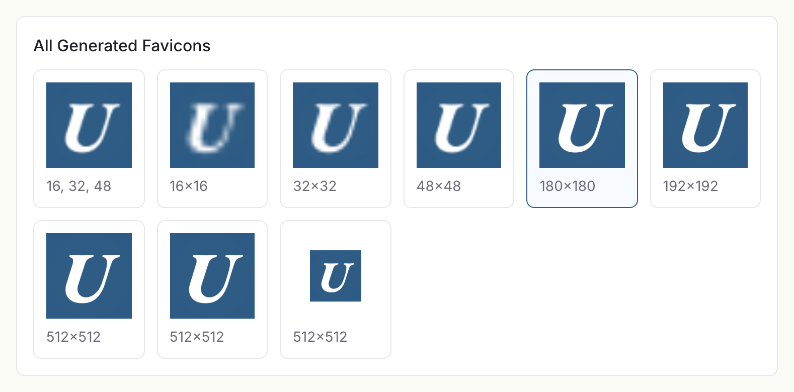
**Our favicon generator does the same job without the upload.** The resizing and encoding run in your browser, so the logo never leaves your machine - the difference that matters when the mark is an unreleased brand, a client's property under NDA, or simply not yours to send anywhere. It produces favicon.ico (16, 32 and 48 packed into one file), the PNG set, the 180 apple-touch-icon, the 192 and 512 Android icons, a maskable 512 with a solid background, and the manifest.webmanifest to go with them - plus the copy-paste head snippet, with presets per platform and framework so a Shopify store and a Next.js app each get the shape their platform expects.
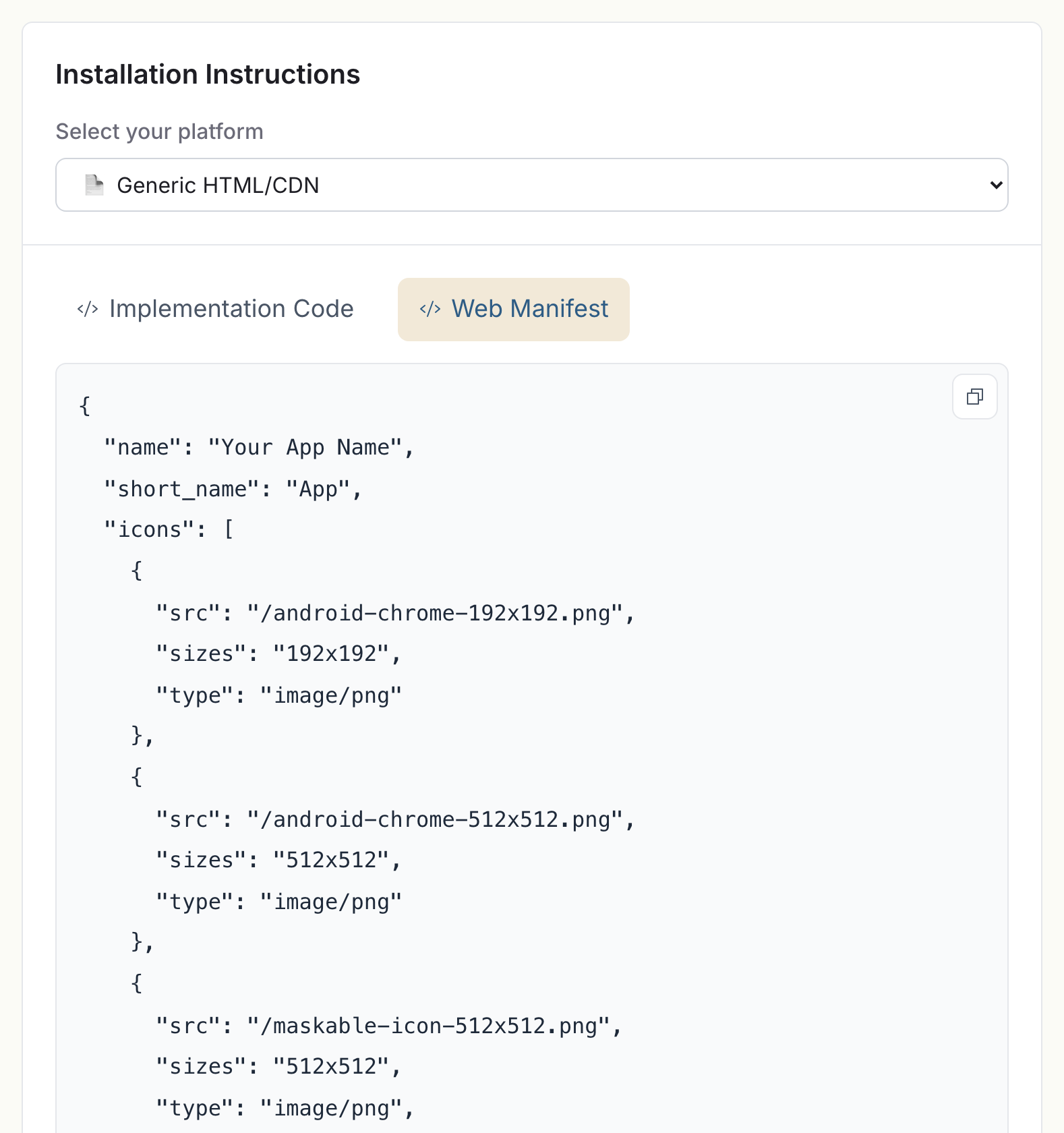
Every field discussed above is sitting in that generated file, ready to copy or download with the icons it references. And the preview grid is worth a look before you download anything, because it answers the question no generator can answer for you: does your mark actually survive at 16px?
Two honest limits of ours. It outputs an SVG favicon only when you feed it an SVG source, because it can't invent vectors from pixels. And it doesn't audit a live site - so the strongest combination is genuinely the two together: generate locally here, then run RealFaviconGenerator's checker against your deployed site to confirm what shipped.
The short version
- Theme-colour meta tag, with a deliberate dark-mode variant. One line each, most useful thing on this page per character typed.
- 180x180 apple-touch-icon with a solid background. Not optional.
- Manifest with 192, 512 and a maskable 512 - if people will install your site. Skip it for a pure marketing site and feel no guilt.
- Pinned-tab SVG only if you're supporting old Safari.
- Test on a real phone, in both modes, from the home screen.
Generate the set with our favicon generator if the logo shouldn't leave your machine, audit the live result with RealFaviconGenerator's checker, and put the whole thing behind you in twenty minutes. Platform-specific install steps live in the platform guides: Shopify, Webflow, Squarespace and Next.js each have their own.